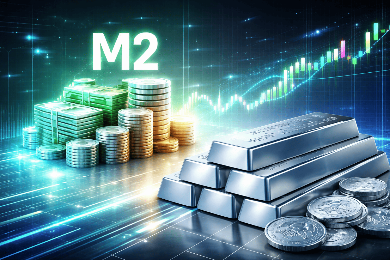
⬤ Silver is catching attention again after analysis shows it's trading well below what its price should be based on how much money central banks have printed. Even though silver is near all-time highs in dollar terms, it looks cheap when you compare it to M2 money supply growth since 1980. The chart tracking this relationship shows just how far behind silver has fallen compared to past monetary peaks.

⬤ The data reveals three important benchmarks: today's actual silver price, where it would be using the 2011 silver-to-M2 ratio (around $97), and where it would sit using the 1980 peak ratio (roughly $531). That means silver would need to jump nearly 500% just to match its 1980 relationship with the money supply. At current levels around $90 per ounce, silver might look expensive on paper, but it's massively undervalued when you factor in how much fiat currency has been created over the decades.
⬤ This gap matters because it shows silver behaving more like a monetary asset stuck at depressed levels rather than properly reflecting currency debasement. The Bloomberg data makes it clear—money supply has exploded while silver prices haven't followed. This structural imbalance has persisted through multiple market cycles and continues to fuel the case for silver as protection against inflation and monetary expansion. While no one can predict when this gap closes, the divergence from historical norms remains striking.