Vlad Demochko
⬤ A long-term weekly chart of the iShares Silver Trust is getting a lot of attention right now, and here's the thing — it's not about what's happening today. It's about what happened back in 2011. The chart lays out exactly how silver behaved after one of its biggest rallies ever, and the pattern it left behind is pretty hard to ignore.
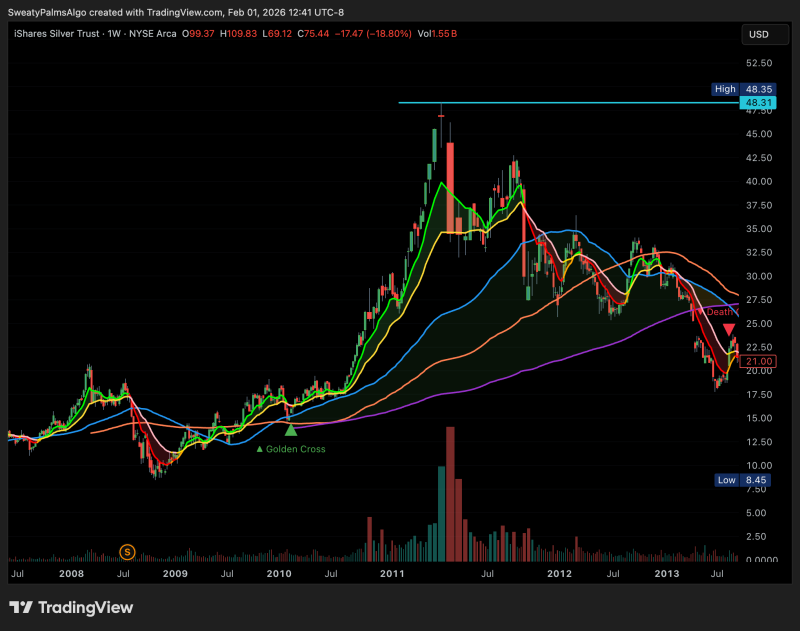
⬤ SLV surged hard into that 2011 peak, punching into the upper $40s before everything flipped. Once it topped out, the selloff didn't mess around — prices dropped fast and kept going. The rally had been accelerating for months, but the moment momentum died, buyers disappeared. What took months to build got cut in half in a matter of weeks.
⬤ After the top, SLV cracked below all the moving averages that had been holding it up during the climb. Lower highs, lower lows — the classic breakdown playbook. There were a few dead-cat bounces along the way, sure, but the trend stayed firmly bearish for a long stretch. The decline wasn't a blip; it was a full structural shift.
⬤ So why does a 2011 chart matter in 2025? Because silver has a history of repeating this kind of behavior. Extreme run-ups followed by sharp pullbacks isn't a coincidence — it's a pattern. Knowing how SLV handled that cycle gives traders real context for reading the current setup, and that's exactly why people keep coming back to this chart.
 Vlad Demochko