⬤ A long-term market indicator has just flashed red for the S&P 500. The warning comes from an unusual source: a meta-ratio comparing stock prices directly against Treasury yields. The SPX divided by the 30-year to 2-year yield relationship has turned lower even as the SPX S&P 500 continues pushing higher.
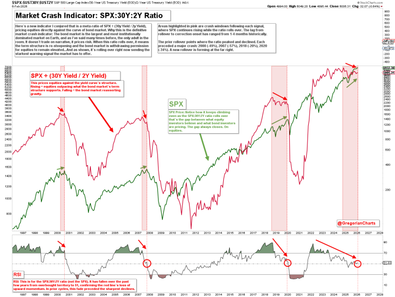
⬤ The chart reveals something unsettling. This same divergence appeared before every major crash since 2000—right before stocks finally broke. The pattern showed up ahead of the dot-com collapse, the 2007 financial crisis, the 2018 selloff, and the 2020 pandemic drop. Each time, the ratio rolled over first while equities kept climbing for one to four months before reality hit. SPX yield curve signal explanation shows how these windows developed historically.
⬤ What makes this indicator particularly ominous is what happened next in those previous episodes. After the ratio turned, markets eventually crashed by 49% in 2000, 57% in 2007, 20% in 2018, and 34% in 2020.
When the reading climbs, stocks are outperforming bonds. When it falls—like now—the bond market is essentially repricing risk ahead of equities. Right now, we're seeing that exact disconnect play out again. The SPX S&P 500 keeps trending up while the underlying ratio deteriorates, creating the textbook setup that preceded those four historical drawdowns. Equity market risk repricing is already underway in fixed income.
⬤ The bottom line: the S&P 500 has officially entered what the bond market calls a crash window. Stocks look fine on the surface, but the Treasury market structure is sending a very different message—one that's been reliable before every major correction over the past 25 years.